Togathre
Mobile event app redesign
Role: UX/UI Design, UX Research, Prototyping
Team: Founder, UX Design Team, Engineering
Tools: Figma, Wix, Miro

Overview
BACKGROUND
When usability testing revealed significant friction across key flows, the Togathre design team decided to rebuild the app from the ground up. I led UX research and iterative prototyping for the MVP redesign, collaborating closely with the design lead and founder to realign the product around user trust, connection, and simplicity.
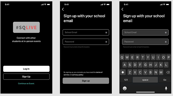
ORIGINAL APP SCEENS

BUSINESS GOALS
Secure investor funding to build a beta app by delivering a user-friendly MVP that demonstrated strong usability and engagement potential
USER PROBLEM
A confusing interface and clunky event creation process made the app unenjoyable and failed to resonate with Gen Z’s need for social connection.
THE SOLUTION
Togathre helps Gen Z connect with peers safely while driving sustainable business growth
Connect with Friends
-
Homepage prioritizes events by friend attendance
-
Direct messages and comments foster community
-
Users can share events and invite their peers


Emphasize Safety
-
Every event has safety requirements displayed
-
Users can rate their safety at events
-
Transparency builds trust
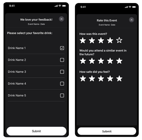
Ratings and Feedback
-
Ratings and feedback mechanisms provide value both to business (data) and users (trust)

IMPACT
✅ Redefined MVP to support a B2B pivot after an initial B2C approach
💰 Secured $40K AWS grant to fund the beta build
Case Study
MY PROCESS
EMPATHIZE & DISCOVER - Understanding Gen Z’s Social Landscape
In the midst of the pandemic, social distancing amplified social anxiety. Students craved genuine connection while still prioritizing their health and safety.
The Context
At the height of the pandemic, students were struggling with isolation. While they longed for authentic social connection, health and safety concerns created anxiety around group events. The design challenge wasn’t just about usability, it was about rebuilding trust.
Joining the Redesign
When I joined Togathre, the team was in the midst of reworking an early concept. Initial usability tests revealed multiple friction points, prompting the design lead to start over. The existing app suffered from an outdated interface, a homepage design that lacked alignment with the product’s overall vision, and tedious user flows that made using the app confusing and frustrating to use.
Why Students?
Togathre was initially built with university students in mind. Leveraging his strong ties to the student community, the founder aimed to create an app that supported their social lives and provided a safer, more connected way to engage with campus events.
User Interviews
To understand the motivations of Gen Z, our team surveyed over 100 students about how they discover and attend events.
When asked what would convince them to attend or not attend an event our survey of 104 students found that 51% of students reported if their friends were going, and 25% reported the safety of the event.

The earlier version of the app focused heavily on location, using a map-based interface that assumed students chose events mainly because they were nearby.
The insights from our survey showed that social proof and safety outweighed event proximity — disproving the app’s original map-centric design. Students cared who was going and whether it felt safe, not where it was.
ORIGINAL SCREENS

DEFINE
How might we help students discover and attend events through trusted social circles, while ensuring transparency and safety at every step?
Persona: Rachel, the Relatable Student
Our research inspired “Rachel,” a 20-year-old student who values being social but feels anxious about large, unfamiliar events. She represents the majority of users who want to connect but need reassurance.
-
Motivations: Attending events with her friends, events that feel safe and inclusive
-
Frustrations: Cluttered UI, lack of transparency, and impersonal design
-
Goals: Discover genuine social experiences with people she trusts

RESEARCH & SYNTHESIZE - Learning from the Platforms Gen Z Already Loves
By analyzing trends and competitors, we learned what resonated with users, what fell short, and how Togathre could carve out its own space in the social app landscape.
Market Research & Competitive Analysis
SOCIAL MEDIA APPS
I was in charge of researching leading social platforms like Instagram, Snapchat, TikTok, and Facebook to understand what keeps Gen Z users engaged. My focus was on uncovering shared social features that build community and spotting where existing platforms fall short.

MAIN INSIGHTS - Strong at Connection, Weak at Real-world Engagement
-
Social platforms excel at helping users see and be seen through likes, stories, and DMs. They make digital interaction effortless, but fail to translate those into real-life connections.
-
Users crave belonging beyond the screen. They want safe, meaningful ways to connect offline, not just digitally.
EVENT AND TICKETING APPS
I also researched Eventbrite, Ticketmaster, Facebook Events, and Fever to understand industry standards and best practices in event discovery, ticketing experiences, and user profiles.


MAIN INSIGHTS - Great at Logistics, Missing the Human Layer
-
Event platforms like Eventbrite and Ticketmaster simplify event creation, ticketing, and discovery, but the experience is often transactional and impersonal.
-
They lack social cues like who’s attending, peer feedback, or safety transparency, all critical motivators for Gen Z.
-
The current event ecosystem prioritizes management over community, leaving space for an app that feels personal, social, and trust-driven.
OPPORTUNITY GAP - Where Togathre Fits In
-
Between social networks and event platforms lies an unmet need: A product that makes real-life connection as easy and natural as sharing a post online.
-
Togathre bridges this gap by combining the social familiarity of platforms like Instagram with the structure and reliability of event apps, powered by features like friend visibility, safety information, and feedback loops that build trust and belonging.

IDEATE - Turning Insights into Opportunities
We explored ways technology could rebuild trust and connection for students experiencing social anxiety — leading to our core design question: how can we make event attendance feel enjoyable and safe?
Brainstorming
During collaborative Figjam and Miro sessions, we outlined the core opportunities to improve the user experience. One idea that stood out was a real-time feedback system, enabling attendees to rate and respond to events as they occur, thereby fostering trust and transparency.


Feature Site Map
Based on our brainstorming sessions and competitive research, we created a sitemap outlining all the essential screens needed to support the app’s core features.

User Flows
I mapped the onboarding and homepage flows to reduce cognitive load and ensure users could intuitively find what mattered: friends’ events and trusted hosts. The creation of user flows helped us prevent missed opportunities or easy mistakes before we start building lo-fi screens.
ONBOARDING FLOW


I added a “Continue as Guest” feature to minimize onboarding friction and boost engagement and reduce potential early drop-off rates. Users can browse freely, with built-in reminders to setup their profile on the homepage.
HOMEPAGE FLOW

I wanted to keep the homepage flow simple by adding a bottom navigation bar to the main features. Filters were later added to the homepage to help users narrow down events and searches.
Mood Board
During our surveys we learned that 72% of participants use dark mode. We leaned into that and decided on dark colors with fun bright accents with high contrast for readability and accessibility. It was a challenge to make it look less techie and more approachable and fun.

PROTOTYPE & TEST - Iterating towards clarity
We adopted a rapid testing approach, validating each new feature as it was developed to quickly uncover and address usability friction.
User Testing
Because of tight funding timelines, we had limited opportunities for formal testing. Instead, we conducted quick, informal sessions with friends, family, and anyone willing to help. These lightweight tests allowed us to validate usability and spot areas where users hesitated or got stuck. Continuous iteration allowed us to spot friction early, refine flows, and validate the design system before investing in high-fidelity prototypes.
During one in-person session with a high school student, she moved through the app smoothly and suggested adding a calendar view for events — a thoughtful improvement we noted for post-MVP development.
“I really like the simple, modern design... the animations and icons make it feel fun and easy to use. Creating events was straightforward, but it might be helpful to have a calendar view to see my events, maybe even with an option to create events right from the calendar.”
- Angelina, 9th grade

Rapid Prototyping
A set of lo-fi designs and prototypes were quickly created and tested.
Below are 2 versions of the Create Event screens. A/B testing was inconclusive for a winner and both designs received iterations. Ultimately we decided V2's design was more cohesive with the rest of the app.
V1 ❌


V2 ✅

DESIGN
High-fidelity iterations focused on contrast, readability, and accessibility, transforming the interface from overly technical to a more inviting, Gen Z–friendly experience.
Visual Evolution
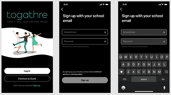
Hi-fi iterations focused on contrast, readability, and warmth, transforming the interface from a sterile, tech-heavy look to something inviting and socially expressive. We decided to change the app name from #SQLIVE to Togathre.
Each iteration brought the brand closer to feeling authentically Gen Z, approachable, inclusive, and community-driven.
V1 - Too techie, low emotional appeal
Onboarding


Homepage & Event Page


V2 - Improved hierarchy, stronger color balance, added haptic touch
Onboarding

Homepage & Event Page


Final - Clear contrast, intuitive layout, accessible and friendly
Onboarding

Homepage & Event Page


Business Pivot: From B2C to B2B
After testing our high-fidelity prototype, our team discovered new ways Togathre could scale and generate value. What began as a student-focused app evolved into a larger opportunity — one that could provide real-time event data to businesses and partners.
Through a series of investor meetings, it became clear that businesses valued access to insights like safety ratings and user satisfaction data, which could help improve future events. This realization prompted a strategic pivot from a B2C model to a B2B approach, expanding Togathre’s reach beyond university campuses to include the wider Gen Z event community.

Core Features
Connect with Friends
-
Events sorted by friend attendance
-
Integrated messaging and comments
-
Shareable events via DMs or group chats
Emphasize Safety
-
Visible safety ratings on every event
-
Real-time “rate your experience” feedback
-
Transparency that builds community trust
Ratings and Feedback
-
Data for the business, reassurance for users
Finals Designs
High-fidelity prototype captured the complete event journey, from login to browsing events, attending, commenting, and viewing flagged events in a personal dashboard.


Design Guide & Design System

IMPACT
REDESIGNED MVP TO SUPPORT B2B AFTER INITIAL B2C APPROACH - discovered ways to balance user needs with business objectives
SECURED $40K AWS GRANT - Prototype presentation secured grant to build out beta app
FUTURE STEPS & KEY TAKEAWAYS
Togathre’s beta version includes all core features, but testing revealed opportunities to:
-
Introduce action-based onboarding with contextual guidance
-
Strengthen marketing clarity around the app’s purpose
-
Continue iterative testing as new social patterns emerge
Togathre isn’t just an event app, it’s a safe social space built on trust and belonging.
By grounding design decisions in empathy and data, our team turned an underperforming concept into a human-centered experience that resonated deeply with Gen Z and caught investor attention along the way.